This applies to image composition mainly, but not only.
Power comes from contrast, and contrast is, among others, small versus broad. This is something to keep in mind when drawing or building an image or designing concept art - small, crowded details with minuscule lines should be opposed to broad, powerful lines. Evenness should oppose randomness, and the more contrast the more power results. Also, one has to keep an eye on homogeneity - too many different elements and the composition will be dirty, unfocused. Too few and it will be empty, sterile. You can have great ranges of contrast and be homogeneous at the same time.
Without both small and broad elements present in the composition, and without a certain degree of homogeneity, there is no (or little) power.
Here are 3 examples.
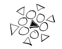
1: dull composition lines/everything is even and too homogeneous
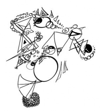
2: messy composition lines/strong contrasts but too random (although I did use only circles and triangles) and absolutely unfocused (too many areas of focus)
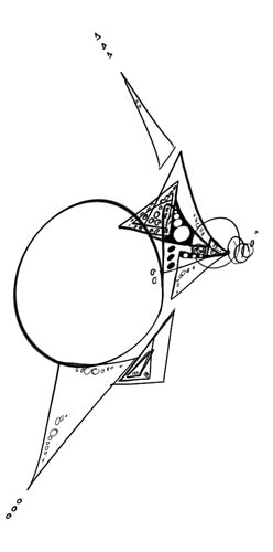
3: powerful composition lines/enough homogeneity, contrast, and clear focus (although I, personally, like less geometric images... :)) One thing I haven't discussed would be balance, though: it's important to balance your composition. Notice how in the picture below I'm using similar elements in left/right and up/down balance; also, the center of interest is positioned not too central and not too close to the margins. Also, the visual elements are grouped and, despite the gaps (they are necessary because they create tension; visual tension creates visual energy), there is a flow, a continuity.
ps - Now some people might actually like image 2 more, and that's because it's more random, more natural, but replace the simple geometric forms with complex natural shapes and you'll realize that image 2 will result in a complete mess, while image 3 has... let's say, more chances to 'read' and have visual impact.
 RSS Feed
