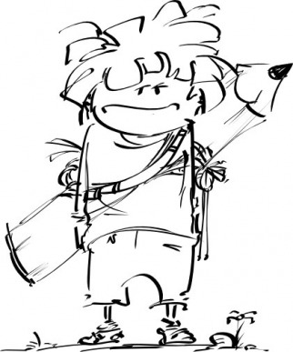
Just random stuff... one random drawing plus one silly lil' taxi animation for an agency in Bucharest .
|
|
|
Just random stuff... one random drawing plus one silly lil' taxi animation for an agency in Bucharest .
Comments
The answer is here: http://www.synchrolux.com/?p=16
This is one of the most honest and brilliant animation articles I have ever come across. By Kevin Koch. A must read. Also, a whole lot more goodies on Kevin's blog, which is an actual animation blog, full of great articles on character animation. Amazing!  Made some changes, added a few terms, overall cleaning, and corrected a few things that seemed not very well explained. Especially... the timing and spacing definition is now completely rewritten. And I'll explain why. For a long time I had my own interpretation of what timing and spacing are. It was what made most sense to me at the time :) Well, it was wrong, because timing and spacing are simply some tools created by animators to work with, and that's all that matters. So what did I think timing and spacing are? I thought timing should be everything that's related to... well, timing... and spacing, guess what, yeah, all that's related to spacing, or to an object's position in space, or along its path of action... It made sense to me to have a simple, solid explanation such as this, and I didn't really understand what these concepts were really used for, by other animators. Not that it matters much to understand timing and spacing theoretically.... I think... if you can apply them well enough in practice :D But anyway, here's the definition now, hopefully correct :D Timing and spacing are abstract concepts created by animators to be used as animation tools. Timing is easier to explain, it represents how much time passes between two keys. Spacing means what happens between the two keys: if the movement is even, if it accelerates, or if it slows down. Basically, if there is more space between poses, visually, the object will move faster. And the other way around. So spacing relates to time more than space, and is actually a timing tool, because the difference in spacial positioning creates a difference in speed. 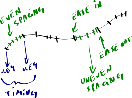 So it's a rather weird thing, all this timing and spacing, very specific, technical, and mostly related to pose to pose animation. Although while animating straight ahead you would also try to plan, in your mind, how to time and space drawings... so we get to pose to pose again. Unless you just disregard timing and spacing and just play freely with poses, but that's art... :) As long as you try to plan accelerations and speed of movement and such... you're using timing and spacing to animate :D
This is the first draft of this version of the fish story (there is an older, very different version, that was too surreal and weird...), doodled on a train ride to Brasov. This is what I worked with to come up with the animatic I posted earlier. As you can see, it's very flat, one camera, one long shot. Or two, if you consider the second part of the story, but the camera is still the same :P So at this stage, the animation was supposed to be continuous... and the characters go in and out of an imaginary stage. The action is clearer though. I also realized this flat staging can be a pretty good tool for sketching ideas. But then, it can also possibly be problematic, because it lends itself to more theatrical storytelling. Anyway, the process of turning this 2D sketch into 3D cinematography was really an eye opener. Click the first pic and then keep clicking on the right side of the image :)   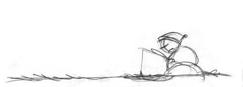 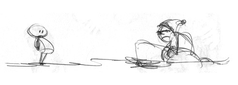 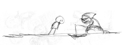 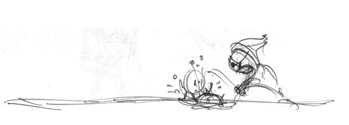 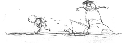 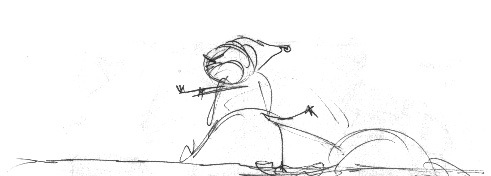   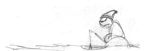 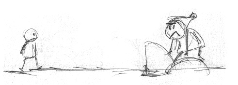 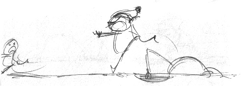 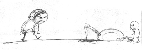 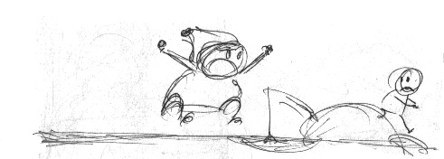 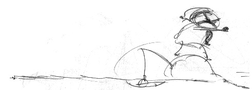  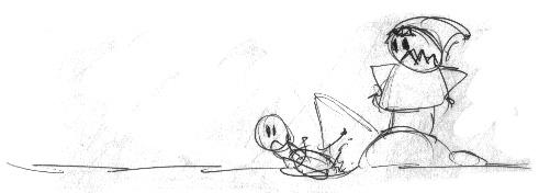 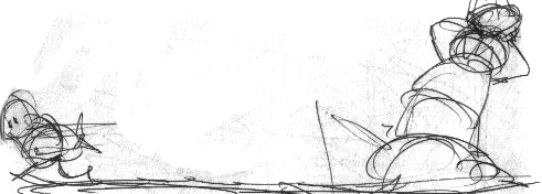 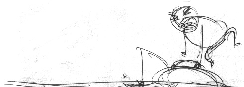 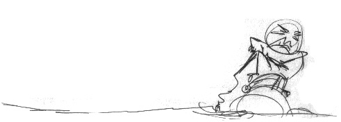  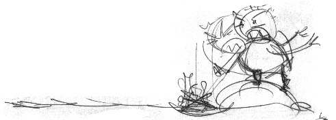 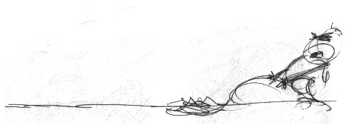 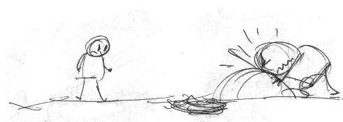 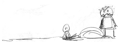 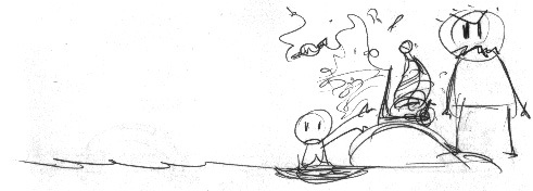       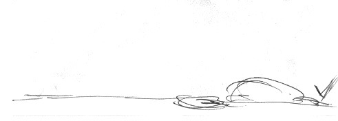 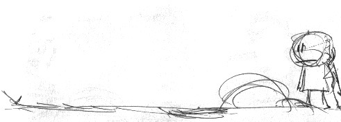 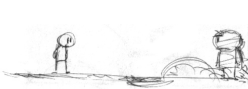 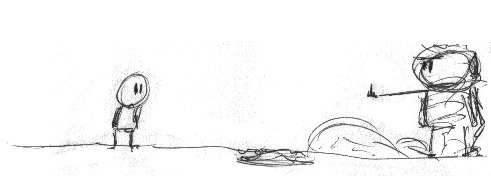 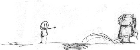 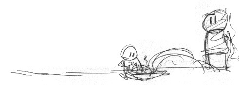 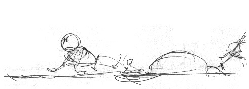 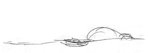     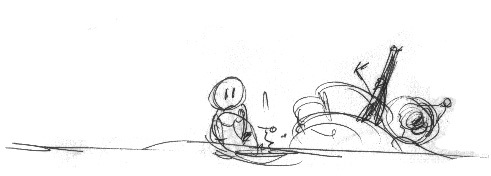 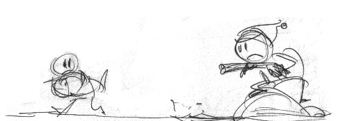 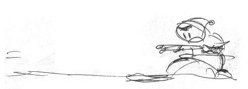 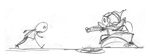      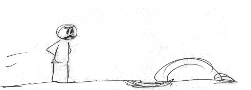 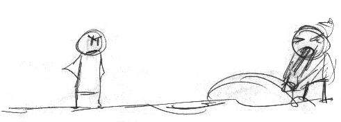 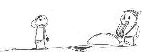  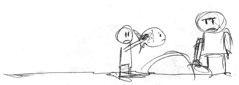 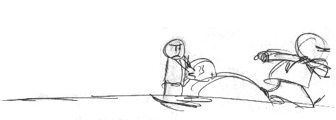 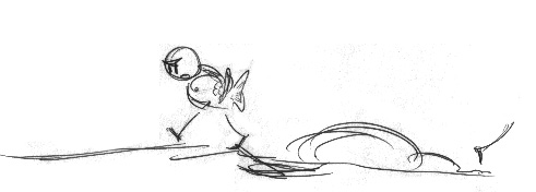   Absolutely amazing animated short by Annable Graham. I like how the guy can create such great atmosphere with just a few simple drawings. He tells the story masterfully, with a great sense of timing. Penderecki's music is also perfect for this, it really gives life to the film. Also, check out Grickle for more of Annable's freaky stuff. He even works on a Grickle game with Telltale Games.
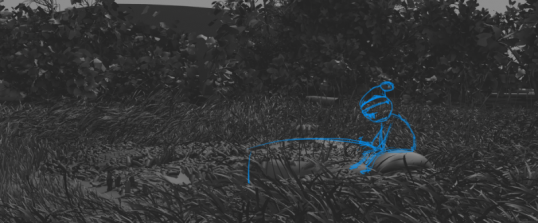 This is an older project of mine that might actually turn into an animated short film. Which would be my first :) I had some attempts before, all kinds of storyboards for all sorts of projects, but no film just yet... So I finally found something that would be worth working on. I have a few older storyboards for The Fish. The older story was pretty surreal and messed up :D Hopefully, this version here makes sense and is less weird, yet, hopefully, funny and interesting to watch. :) So, of course, I want to document the making of this movie, using this here blog. Sooo... first thing, I have a sketched version of the story, drawn on paper (like always, on the train, my favorite place to draw). I'll scan it some time next week and post that too. It's flat, very 2-dimensional, one camera, one long shot, very much like a comic strip, with 2 characters staged very defaultish on some sort of a... stage. They just go in and out of the stage. For a long while I actually was in doubt about turning this story into a movie, despite the fact that I really want/ed to, precisely because the story was working so well as a flat comic strip, while I wanted to do something more dynamic, more cinematic... more of a film and less of a comic strip. So recently I set myself to turning the flat story into a 3-dimensional thing, which was a really interesting experience. I first built a quick mock up scene in Maya, similar to the actual set I will build later on, and I used it to experiment with cameras inside this space. I also sectioned the story into shots based on a dialogue-between characters type of logic (although the characters don't actually speak). I have a lot of cameras just going back and forth between the 2 characters. So I managed to fragment the story and discovered that it actually helps the flow of things, because I get to throw out the unimportant fluff and focus more on the timing and pacing of what's really important. This first rough animatic is drawn on top of rough 3D Maya renders. It has, well... rough and pretty even timing. Next step, I guess, is to further work with it, and start doing some character design (although I already know that the 2 guys will be very much like my other puppetzoids, so simple design, but I still have to work out the details, and especially think about the facial rig). Also, the scene needs some more thinking, this first pass is pretty messy. I don't know yet if I'll keep the tall grass, which is a technological problem if I have to constantly interact with it. But I also happen to love it :) The trees around the set will probably be removed and the landscape remodeled. Anyway, click here to download the full rez (30MB), or click below and watch the half rez animatic (9MB).  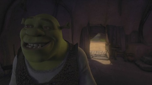 This one has been seriously bugging me fooor aaaa looooong tiiiiiime. So here we go. I'm sure I'm not the only one to notice that there is something weird and unappealing about these Shrek movies. For a long while, I thought it was the animation, that it didn't have proper weight or something... Honestly, I still don't know exactly what's wrong with Shrek, but here are some thoughts. 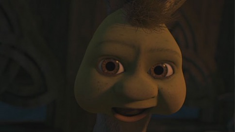 Numero Uno. Shrek has unfortunate character design, especially for an animated movie. This affects the overall appeal of the image and of the animation. Basically... no matter how you pose those things, they're not going to look good. Shrek feels more like a struggle to get the models to look OK, and the struggle messes up the animation. When the characters look sexy from any angle, animating is easier and there is a constant level of quality and appeal all throughout. In Shrek, they look more like generic 3D creations... like some sort of Poser characters with better texturing and shading. Shrek tries to be cartoony-photoreal and it just looks weird and wrong. So to sum it up, bad design, leading to a lot of bad poses. 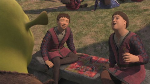 Numero 2. Shrek doesn't have bad animation, but I think the animation doesn't fit very well the character design. The design is more towards an awkward sort of realism, but the animation is a bit too cartoony, springy, bouncy, for this design. It just feels like the weight is off, because the weight is messed up with all the cartooniness happening. I may be wrong about this one though, since cartoon animation has been used successfully on semi-realistic humans. But there are shots in Shrek that just have this weird weightless feel... 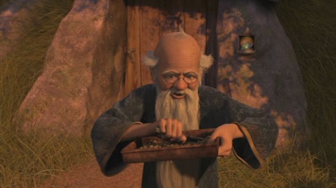 Numero 3 Hands in the air. Too much of it. There are a lot of empty hand gestures in Shrek, hands hanging in mid air, looking IKish (with the elbows suspended too high, too un-gravitationally...). This is an animation problem, but it starts from story-telling and directing. A lot of time the characters don't have anything to do, in particular, and especially with their hands. So... instead of just doing nothing, or something meaningful, they float around... (Look at Merlin's hands in the image above for example. That's no way to hold a spoon or, especially, a 'plate'.) 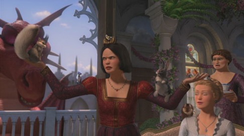 Numero 4 The stiffness of Shrek may also be a matter of insufficient dynamics in terms of cloth and deformations and environment, effects, plants... The sort-of-realistic look of Shrek could use, I guess, more complexity in this area. It does have a ton of cloth simulation, but it doesn't look good or realistic, or complex enough, rather simplified. Overall, it feels stiff. I think that due to sheer complexity of the project, a lot of corners have been cut and lots of things have been automated and simplified. Which leads me to 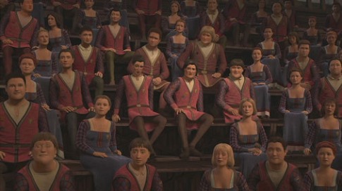 Numero 5 Lots of ugly looking crowds and secondary characters. The creators of Shrek have used a procedural approach for generating the tons of characters in the movie, and despite the variety... they all look awful. Well, in fact, if the main characters look bad, the crowds couldn't look much better, could they... hehe. I think, again, the design is not helping this proceduralism at all. The procedural humans created for The Incredibles look really good (despite the fact that the creators of The Incredibles seem to have been not so pleased with the procedural-man approach to character creation). Anyway, different design altogether. 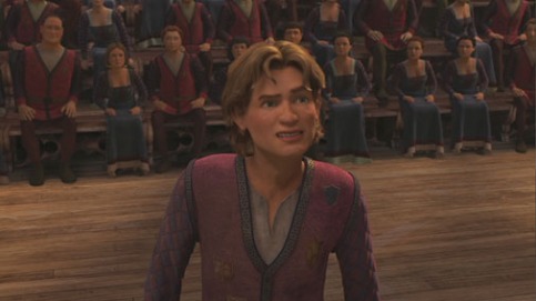 Numero 6 The facial rig, which in its day was probably awesome (I guess they've reworked a lot of it meanwhile, but all in all, the results are very similar), is not really that great for this design. It's supposed to be based on anatomical studies and all, but it's only a crude simplification of real human facial deformations. That being said, I'm sure it's a fantastic rig, for characters like 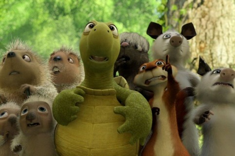 but not as fabulous for a more realistic design, it seems. In fact, realistic facial animation has only very recently started to look acceptable, most of the older stuff is weird and wrong, too stiff... too watery...too rubbery...too whatevery...too little detail... Anyway, it's still a huge struggle. 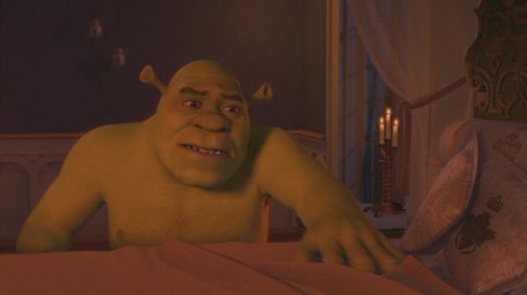 Numero 7 Shoulders. Square. Ugly. Most characters have these square... awkward... tubes... instead of upper arms and shoulders. I think they're among the weakest parts of both character design and 3D work - they also deform so badly, I think, because they've been set up to be friendly with the cloth simulation that has well known problems around areas like shoulders. 2 more tubes in the image below: 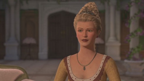 And I'll stop here, the list gets too long :D Let me add a few more pics, carefully chosen for their awfulness :D 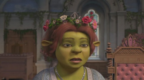 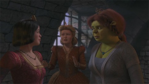 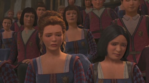 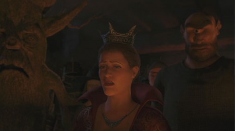 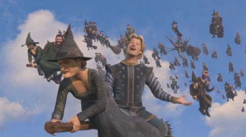 Oh, I forgot, colors and shadows... the overall look... I won't get into it, some of it is awesome, but some... just... 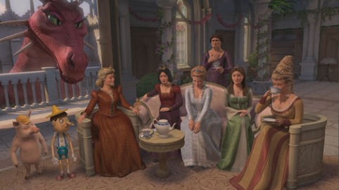 Not all problems are apparent all throughout the movie, some shots are better looking, some characters are better looking... like the furry dudes, Donkey and Puss, the horses are pretty sweet too, but overall... the feeling is that of awkward. PS - I like this guy in the image below: 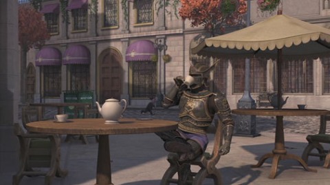 |
About me
I'm a character animator, visual artist, game dev, and music composer. I like to doodle, write, experiment, and plan my next big thing. I love tech that inspires and enables art. I have a formal background in music composition. And I like to walk around the world and see things up close. Archives
February 2022
|
 RSS Feed
