Howdy ho! :)
So... I've been experimenting this weekend with both character design and backgrounds. You liked that layered cardboards look and I kind'a realized it's a bit tough to integrate it with the handdrawn look, but I've tried a few things. I was thinking we could take a midway approach of having a few layers of drawings and paint, and each layer then gets made to look like an object that has width and catches and projects shadows, but I'm not so sure about it yet. I explored this in Photoshop for now, but we can try layering things in Maya as well and render realistic shadows instead of drop-shadows. Depends on the look.
OK, let's take a look at some drawings. They're more like explorations, and if you decide which direction you want to go, I'll go ahead and create the actual character sheets. I tried to keep the design as simple and animation friendly as possible :) so I can animate this quickly, since we have rather little time for the actual production.
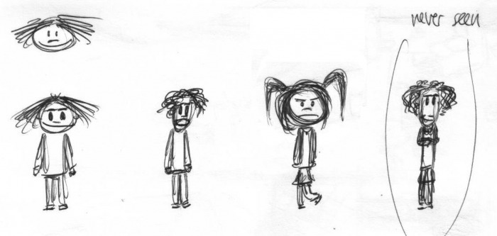
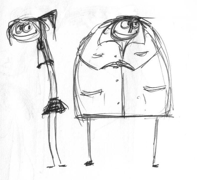
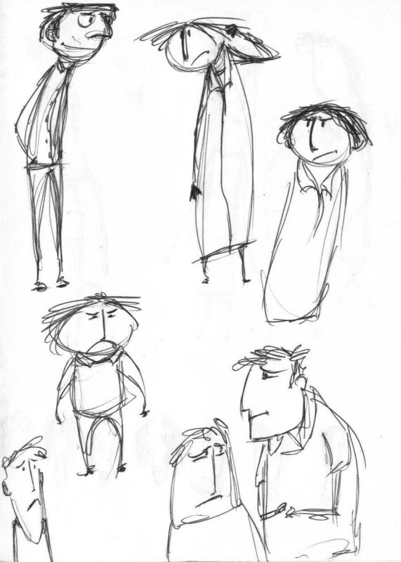
First, after a few doodles I came up with this design, which has all the characters both adult and child versions. I'm thinking about going with this kind of look for the heads at least (2 circles and 2 oval-ish faces), I think it would be simple and easily recognizable. (don't mind the weird Rory pose pls, hahaha, I drew everything in ballpoint pen... anyway, it's not like a final character sheet, just a rough :D ) Click the images for their larger versions (I'm sure you realized that anyway, but ...eh.).
So... I've been experimenting this weekend with both character design and backgrounds. You liked that layered cardboards look and I kind'a realized it's a bit tough to integrate it with the handdrawn look, but I've tried a few things. I was thinking we could take a midway approach of having a few layers of drawings and paint, and each layer then gets made to look like an object that has width and catches and projects shadows, but I'm not so sure about it yet. I explored this in Photoshop for now, but we can try layering things in Maya as well and render realistic shadows instead of drop-shadows. Depends on the look.
OK, let's take a look at some drawings. They're more like explorations, and if you decide which direction you want to go, I'll go ahead and create the actual character sheets. I tried to keep the design as simple and animation friendly as possible :) so I can animate this quickly, since we have rather little time for the actual production.
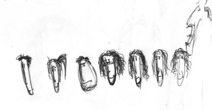
First, after a few doodles I came up with this design, which has all the characters both adult and child versions. I'm thinking about going with this kind of look for the heads at least (2 circles and 2 oval-ish faces), I think it would be simple and easily recognizable. (don't mind the weird Rory pose pls, hahaha, I drew everything in ballpoint pen... anyway, it's not like a final character sheet, just a rough :D ) Click the images for their larger versions (I'm sure you realized that anyway, but ...eh.).

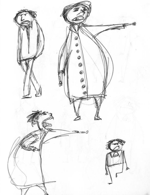
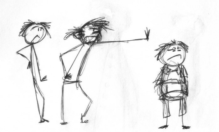
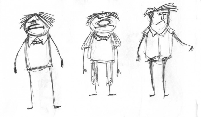
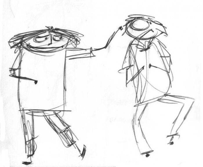
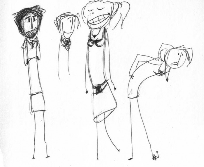
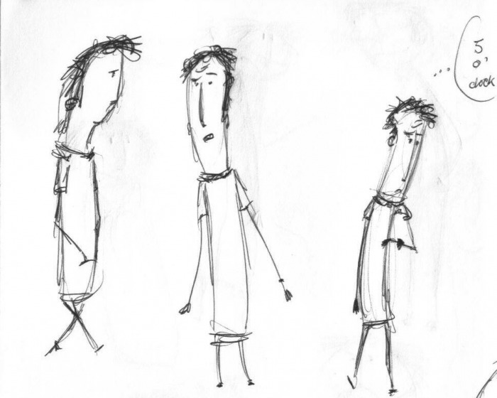
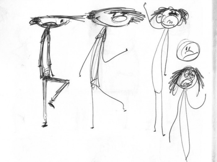
OK, more drawings exploring different shapes, proportions, combinations of things...

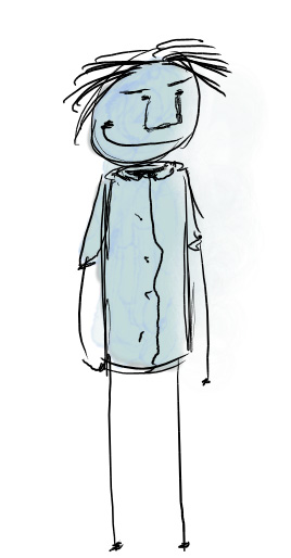
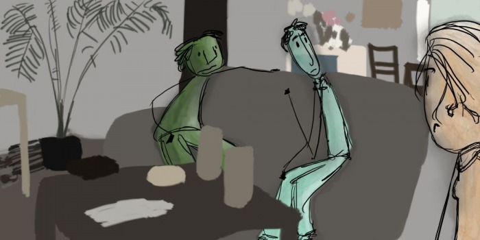
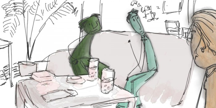
Next, I started playing with paint and color. Watercolors and a bit of shading seem to fit these drawings pretty well so... I managed to find a way to fake watercolors with the tools in TVpaint, in a way that's both pleasing to the eye and robust/reliable for production and fast/easy to paint. Here's a dude, I kind'ah liked this stick figure limbs look :D
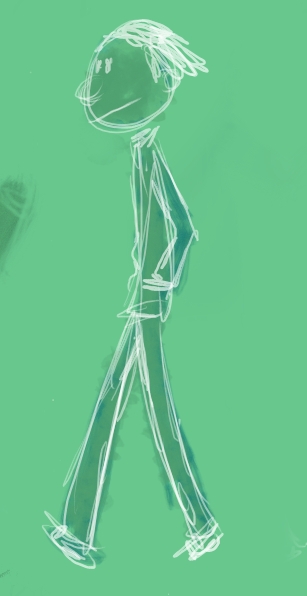
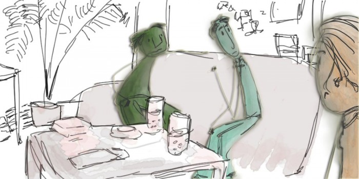
Here's a look at stick figure-ish clean-ish simple-ish... with paint... and minimal background; not so crazy about this one.
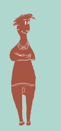
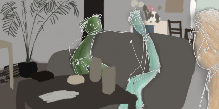
Or how about white line. I initially thought it would be easier to implement, but this is a tricky one, since it's only visible on darker colors :D
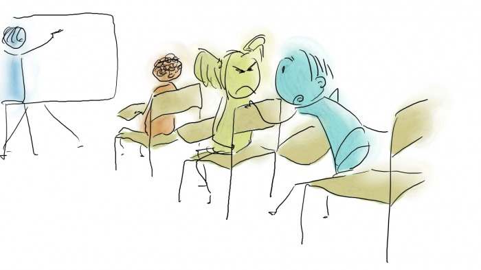
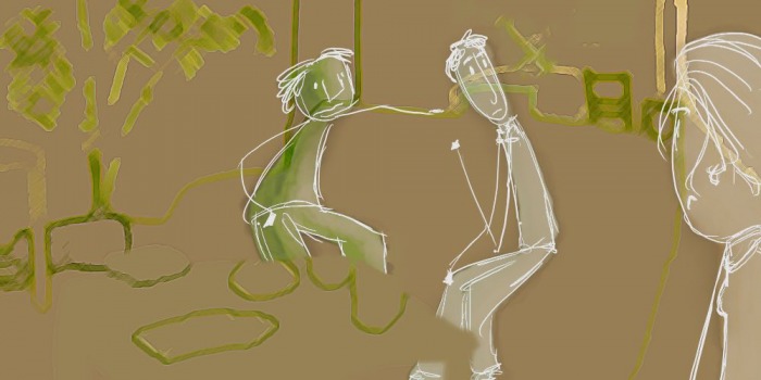
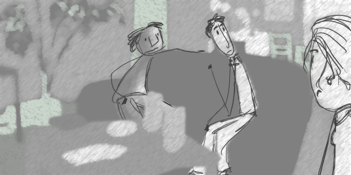
And then I grabbed a frame from the trailer and painted on top (I replaced it with paint and drawings), to explore some layered stuff (the cardboard-ish layered shadowy stuff... :P). Doesn't seem to work so well with a brushy look, probably works much better with simple shapes. I haven't explored in that direction yet, but I have a hunch you might want that, so I will :D What I did for now is more handdrawn stuff and stuff that I felt works best with this handdrawn style of mine. So I abandoned the idea of layering the image with drop shadows in between the layers, and explored more looks with Photoshop. Not happy with what I came up with so far in this direction, but I'm posting the images anyway...


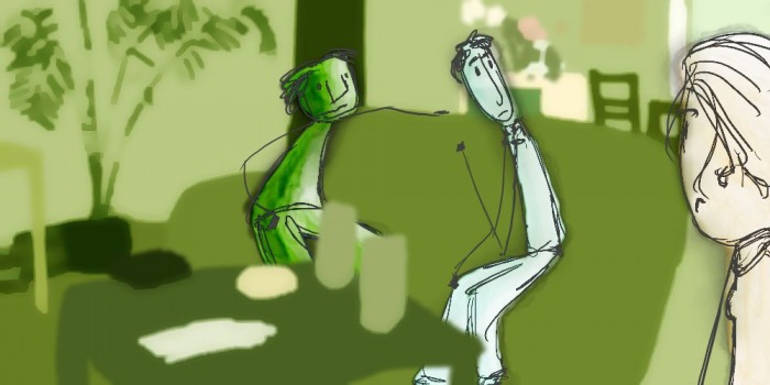
And then I thought how I about I just draw the background, very rough, very loose... and maybe add some paint, and last thing, I added some drop shadows and glow to the layers and played a bit with that, which ended up in something pretty interesting in this context.


Overall, I'm not so crazy about the detailed backgrounds though and I wouldn't use the layered cardboards look (which I am aware I haven't explored properly here, but more because, right now, I don't see it integrating so well with the handdrawn characters... may have made a mistake presenting that :D well, we'll see :D). I'd rather have something really minimal for the background, like just a drop of color and a few lines maybe.
Last thing, please keep in mind these are more like explorations rather than proposals for a final look.
Last thing, please keep in mind these are more like explorations rather than proposals for a final look.
